LING'S CARS
WEBSITE REDESIGN

A semester-long HCI project where my team redesigned one of the most chaotic websites on the internet into something people could actually use.

HTML5 CSS3 JavaScript UX Research Figma Team Project
▶ VIEW ON GITHUB
STEP 01 / PROBLEM STATEMENT

WHAT WAS WRONG WITH THE ORIGINAL SITE?

Our team started this project by looking at several websites that had real usability problems. We ended up choosing Ling's Cars (lingscars.com), a UK car leasing website that is honestly one of the most overwhelming pages on the internet. The homepage is packed with flashing animations, bright clashing colors, giant text everywhere, and so many moving elements that it's hard to even figure out what you're supposed to click on.

After doing a full heuristic evaluation, we found five specific problems with the site. The first was extreme visual clutter that violated Nielsen's heuristic of aesthetic and minimalist design. Every single part of the page was trying to grab your attention at the same time, which meant nothing actually stood out. The second problem was that there was no help or guidance for first-time car leasers. If you didn't know how leasing worked, the site gave you basically no information. The third issue was that when you clicked something, the page gave you no feedback, so you didn't know if anything was happening. The fourth and fifth problems were both about consistency. The site used a vertical layout in some places and then suddenly switched to horizontal, which felt jarring. And if you browsed a few cars and went back to the home page, the layout actually changed on you and showed fewer brands than before.

The main user problem was simple: someone trying to find and lease a specific car had no clear path to follow. There was no filtering, no organized navigation, and the leasing process was buried under noise.
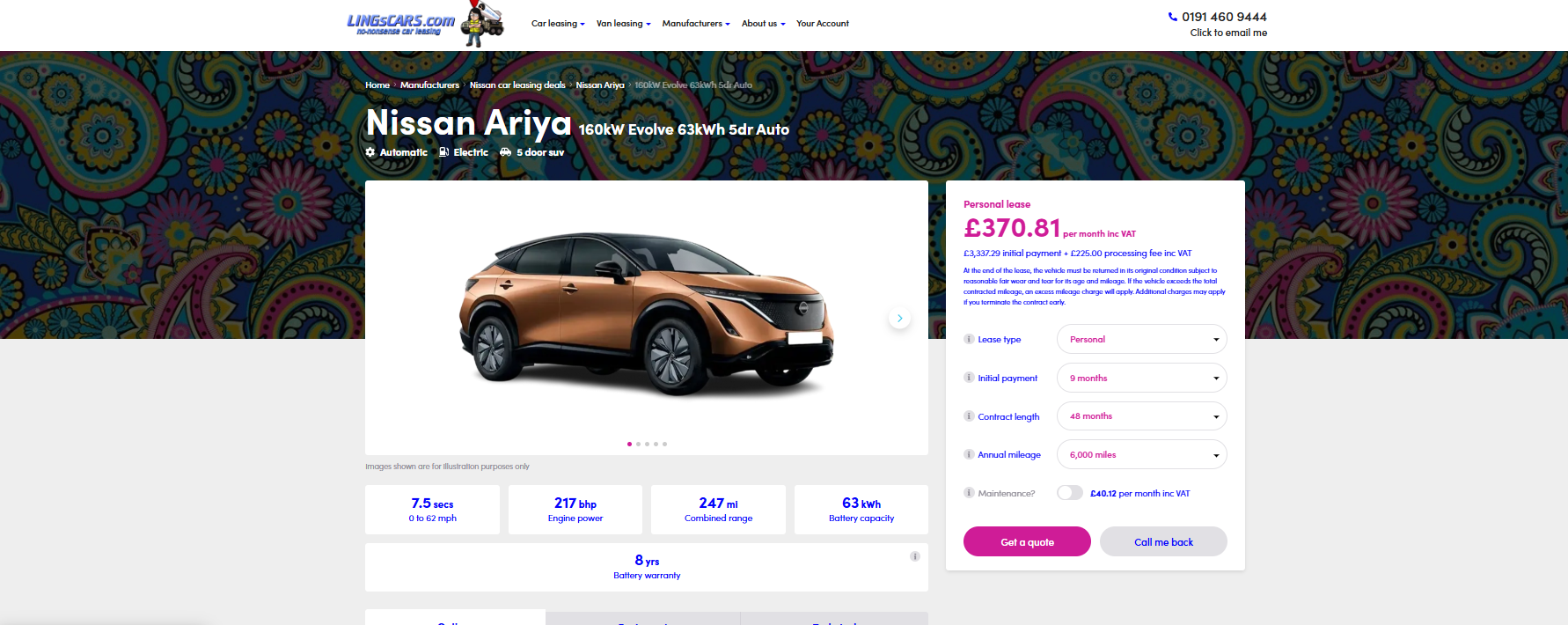
Original Ling's Cars car details page
ORIGINAL LINGSCARS.COM - car details page with visual clutter and unclear pricing
HEURISTIC VIOLATED
Aesthetic and Minimalist Design (Nielsen #8)
HEURISTIC VIOLATED
Visibility of System Status (Nielsen #1)
HEURISTIC VIOLATED
Consistency and Standards (Nielsen #4)
STEP 02 / LOW-FIDELITY SKETCHES

STARTING WITH PAPER SKETCHES

Before we touched any design software, we drew our ideas on paper. Our design concept focused on three main goals. We wanted to make sure the home screen never overwrites itself when you browse around (fixing the consistency problem), we wanted a consistent visual hierarchy across all pages, and we wanted to seriously reduce the visual clutter by limiting fonts, colors, and decorative elements.

The sketches covered a desktop home page with a search bar, a navigation bar, and a featured cars section, a mobile version where the nav collapses into a hamburger menu, a car details page showing the car image, price, and lease information side by side, a quote form page with real-time validation, and a loading state with skeleton placeholders so users know something is happening.

On the mobile version specifically, we knew content needed to stack vertically and buttons had to be large enough to tap. The search bar was positioned at the top in both versions since that's where users expected to find it.

STEP 03 / PEER USABILITY TESTING - ROUND 1

TESTING THE PAPER SKETCHES

Once we had our sketches, we tested them with five different people. We gave each tester four tasks: find the button to order a car, locate a brand of car, identify key details about a car, and find where they would start their search. We asked questions before, during, and after each task to understand what was going through their heads.

The results were really useful. Multiple testers hesitated when trying to find the order button because it was unclear whether clicking "View Deal" actually meant placing an order. One tester spent over 25 seconds going back and forth between pages trying to figure out how to continue. Multiple people expected visible filter options instead of just a search bar, and almost everyone said the car details page felt incomplete because there were no specific labels for things like mileage, lease length, or deposit amount.

"The wording was unintuitive for the view deal button. Renaming the button might help with clearer understanding."

- Tester feedback, Round 1

"The car details page feels incomplete. I would need more specific information like mileage and lease length before making a decision."

- Tester feedback, Round 1

Based on this feedback, we identified three changes to make before building wireframes. We needed to add clear section labels on the car details page. We needed to make the purchase or lease action more obvious with better button wording. And we needed to add a proper search and filter system since multiple people asked for it without being prompted.

STEP 04 / WIREFRAMES

BUILDING WIREFRAMES IN FIGMA

We took the feedback from the paper sketch testing and built proper wireframes in Figma. Each page was designed for both desktop and mobile. On the home page, we added a front page search bar back in because testers kept going there first, and we tied it to a filter panel on the left side of the listing page that lets users sort by price, make, model, and type.

The car details page got the biggest update. We reorganized everything into clearly labeled sections. The monthly price went at the top so users see it immediately. Below that are the upfront cost and deposit in a larger font with the lease button right below the pricing. Then further down are the car features and lease information in separate sections with bigger headers so you can scan the page quickly.

I personally added an error page to the wireframes to handle the case where a page fails to load. The original site had no feedback at all when something broke. Our error page shows a clear error code, a short explanation, and two action buttons to either browse cars or return home, while keeping the navigation consistent so users never feel completely lost.

The bottom of the home page also got a "Previously Viewed Cars" section so users can pick up where they left off, which directly fixed the consistency problem where the original site would overwrite this area after browsing.

STEP 05 / WIREFRAME TESTING - ROUND 2

TESTING THE WIREFRAMES

After building the wireframes we tested them with four more people. The tasks this time were similar but more specific. We asked people to find a car to order, find a car brand, find the deposit amount, and order a car. We watched for hesitation, misclicks, confusion, and anything they said out loud while navigating.

The brand section on the home page worked really well this time. People found it quickly and had no trouble. The car details page was still causing some confusion though. One tester struggled for over 25 seconds trying to navigate to the deposit amount because the clickable area on the car list was too small. Users were clicking on the text in the row but the actual button was off to the side and not obvious enough.

Another tester was thrown off by the leasing form asking them to type in the car model after they had already selected the car from a details page. That felt redundant and made no sense to them.

REVISION 1
Reorganized pricing section so monthly, upfront, and deposit costs are grouped clearly with bigger font
REVISION 2
Made section headers larger so users can scan the car details page faster
REVISION 3
Expanded clickable area on car list rows and improved button signifiers
REVISION 4
Removed redundant "car model" field from the leasing form since users came from a specific car page
STEP 06 / HIGH-FIDELITY PROTOTYPE

INTERACTIVE PROTOTYPE IN FIGMA

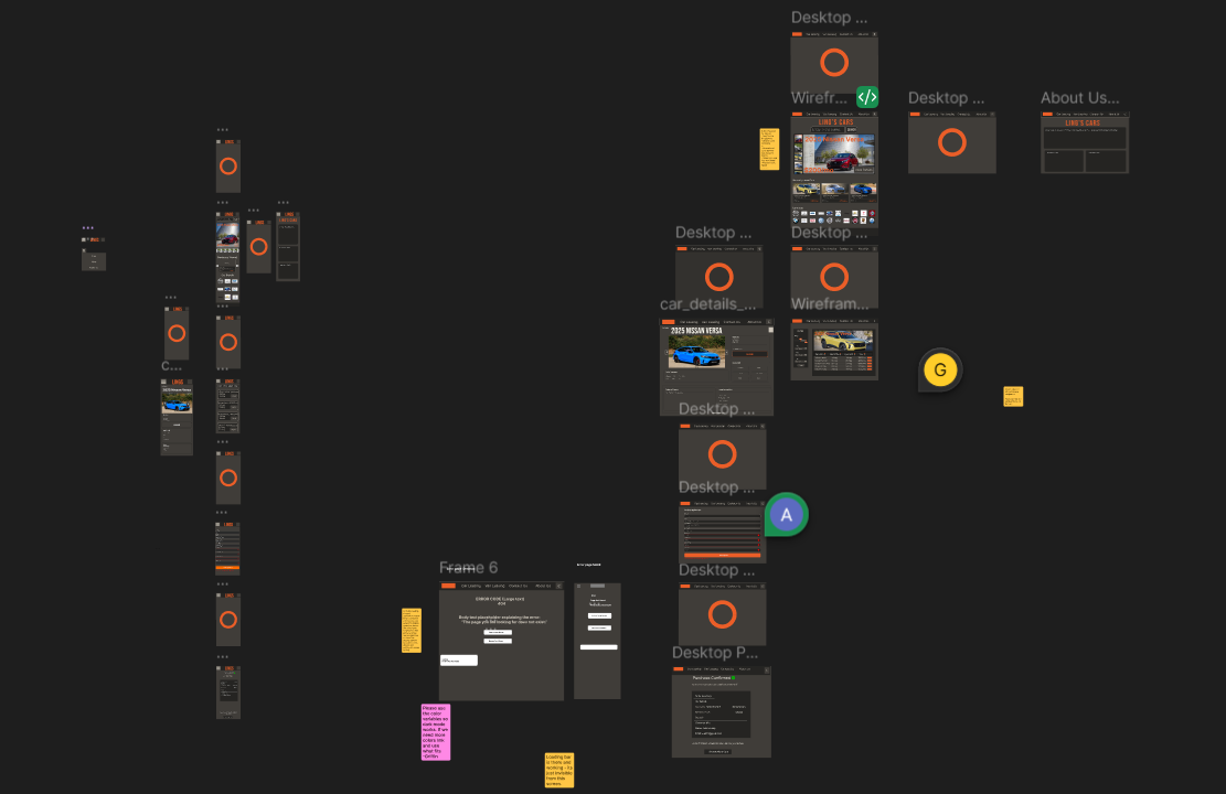
After revising the wireframes we built a full interactive prototype in Figma with both desktop and mobile versions. The mobile version was prioritized first and uses a vertical layout with a hamburger menu and larger touch-friendly buttons. The desktop version uses a horizontal navigation bar and a more spread out layout to take advantage of the extra screen space.

We built out three complete user flows in the prototype. The first one shows the full search and leasing process where a user finds a car, goes to the details page, fills out the leasing form, submits it, and sees a confirmation screen with loading states in between each step. The second flow shows how a mobile user can browse, change their mind, use the menu, and navigate to a different car. The third flow shows a user on a car details page switching the site from dark mode to light mode and then finding the contact information through the About Us page.

Figma high-fidelity prototype showing desktop and mobile views
HIGH-FI PROTOTYPE - desktop and mobile layouts side by side in Figma
▶ VIEW FIGMA PROTOTYPE
STEP 07 / PROTOTYPE TESTING - ROUND 3

FINAL ROUND OF USER TESTING

We did one final round of testing on the interactive Figma prototype with four people from other groups in our class. The tasks were finding a car to order, toggling dark mode, finding the deposit amount, and completing a car order from start to finish.

This round went much better than the first two. Most testers navigated through the main flow without major issues. One tester found the car, filled out the form, and described the whole process as "very simple and easy." The dark mode toggle was found quickly by most people, though one tester said the moon icon was a bit confusing and wanted a clearer icon to indicate what the button does.

The biggest issue that came up was that when one tester was in light mode, the text on the car details page was invisible because the text color hadn't been updated to work on a light background. They had to switch back to dark mode to read the information. We fixed that immediately after the test session. The form also caused a little confusion for one tester who wasn't sure if their submission went through. We discussed adding better form verification to address that.

"It was easy to find cars, but I wasn't sure if the search bar was fully functional yet so I just scrolled through instead."

- Tester, Round 3

"The process going from leasing to the form to the purchase confirmation felt very simple and easy."

- Tester, Round 3
BUG FOUND AND FIXED
Text was invisible in light mode on the car details page - color values corrected
IMPROVEMENT PLANNED
Better form validation feedback so users know their submission went through
IMPROVEMENT PLANNED
Clearer light/dark mode icon so users know what the button does before clicking
STEP 08 / FINAL PRODUCT

WHAT WE BUILT

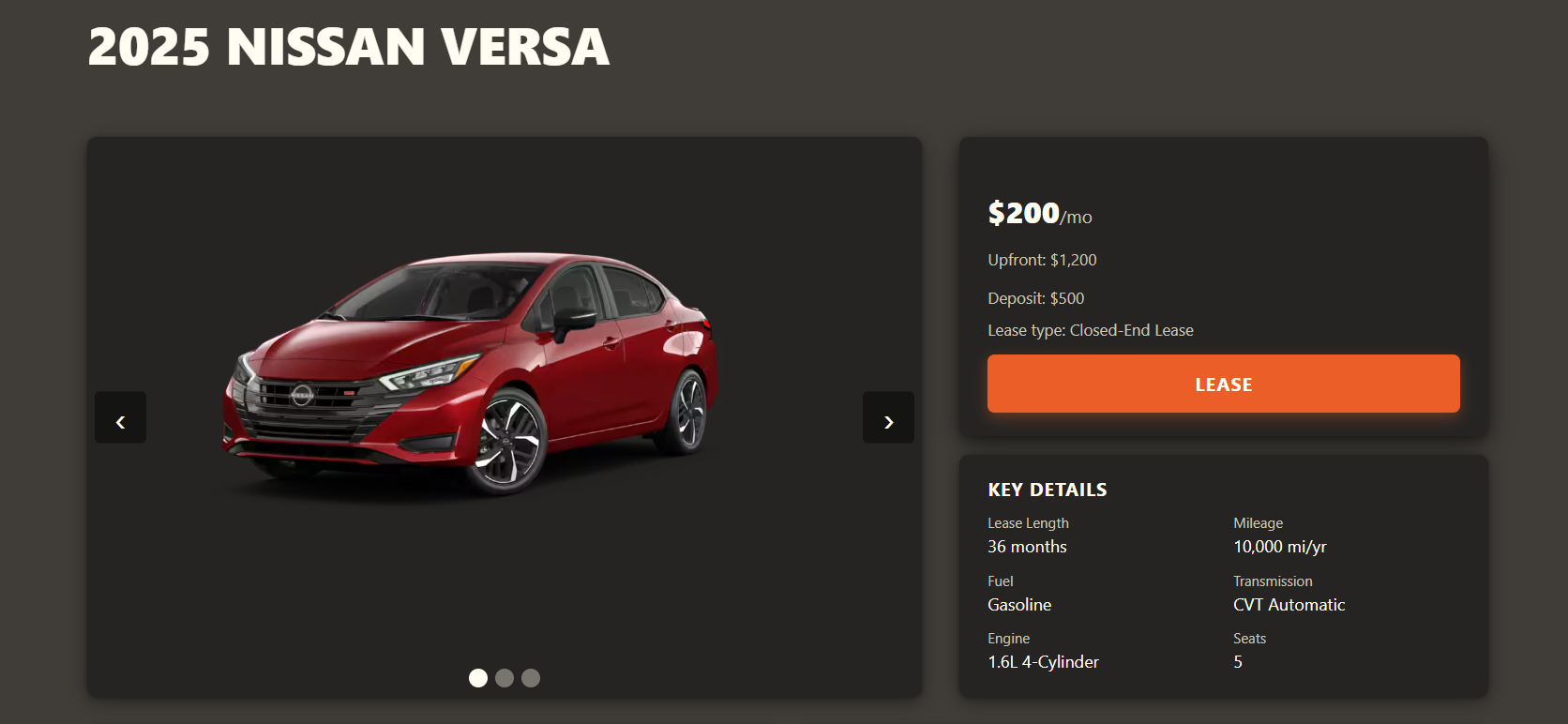
The final coded version of the site is built with vanilla HTML, CSS, and JavaScript and is fully responsive across desktop and mobile. The listing page lets users filter and sort cars in real time without any page reloads. Each car has its own detail page with the price prominently displayed, clearly labeled sections for specs and lease information, and a leasing form with client-side validation.

Compared to where we started, the redesign solves all five of the heuristic problems we identified. The visual clutter is gone. There is now clear feedback when actions happen. The layout stays consistent no matter how much you browse. First-time users can find what they need without having to call anyone. And the leasing flow actually has a logical start and end.

This project taught me a lot about how small layout decisions can completely change whether or not a user feels confident navigating a site. We ran three full rounds of testing across the semester and every single round gave us something new to fix. The Jared Spool quote we used at the start of the semester really stuck with me: good design becomes invisible, and the only time you notice it is when something goes wrong.

Final coded car details page
FINAL - coded car details page with clear pricing, labeled sections, and leasing form

VIEW THE PROJECT